
There are a number of small adjustments you can make to your Sways to ensure increased readability and accessibility for everyone. These include adding descriptions to images, applying clear style templates with good colour contrast and adjusting the font type and size.
Adding descriptions to images
Alternative text descriptions are added explanations for images to convey the meaning of the image to anyone with vision impairment. This is essential for people who need to use screen reader software for example Read and Write to read aloud the content on screen rather than view it.
Microsoft Sway has a feature called the Accessibility Checker to review alternative text on all the images in your sway. To access this feature open the presentation Storyline mode, click on the 3 dots menu and select Accessibility Checker from the menu.
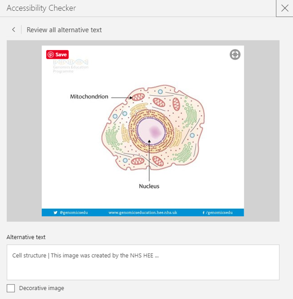
Images inserted into Sway from a search source will display the either the name of the file or the existing alternative text. You can edit these default descriptions in the Accessibility Checker. Your text descriptions should be meaningful and only added to images that have a purpose. Images used for adornment can be marked as decorative in the Accessibility Checker.
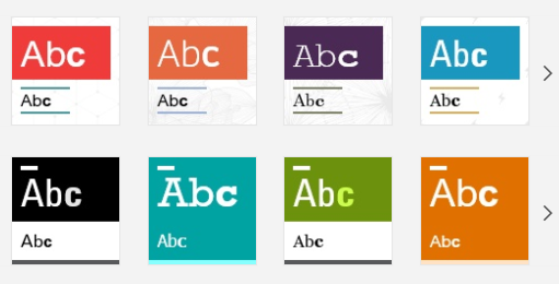
Choose clear styles with sufficient colour contrast.
Sway offers many inbuilt templates to easily change the presentation look and layout. In choosing one of the Sway styles it is advised to choose a clear design with good contrast between background and text avoiding cluttered backgrounds.
Increase text readability
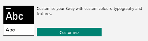
Once you have selected an appropriate Style template for your presentation you can customise the font type and its relative size. In the Design mode click on the Styles pallet icon then the Customise button to adapt your selected style.
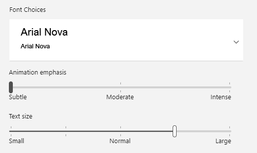
Once in the Styles menu you have numerous options to change the font to a specific type. A sans serif font is generally recommended such as Arial. The text size can also be increased and this will be displayed relative to the device screen size .
Applying these changes will not only improve accessibility and readability but also viewing across different devices.
You can test how your site is looking by clicking on the Play button. You can also view your presentation in Accessibility Mode.
Summary to steps to take to improve inclusivity of Sway presentations
- Provide meaningful alternative descriptions for images with the Accessibility Checker tool.
- Chose a simple uncluttered style within the Styles menu.
- Set the default font choice to a sans serif such as Arial in the Customise styles area.
- Increase the text size with the slider tool in the Customise styles area.
Further Resources
Make your Sway design accessible to people with disabilities
Everything you need to know to write effective alt text
Guide to creating accessible learning resources