
Blackboard have recently introduced a refreshed interface designed to make teaching and learning more intuitive and efficient. This update will help you find information faster, reduce clicks, and simplify tasks such as managing courses, grading, and configuring settings.
Please note that this global update follows the way many cloud hosted software products (often called SaaS – Software as a Service) have updates delivered.
The changes reflect extensive feedback from instructors, administrators, and students and aim to:
- Use screen space more effectively
- Reduce navigation errors, such as accidental exits
- Improve performance and page load times
- Provide clearer context and orientation
- Minimize motion for smoother navigation
Perhaps the most noticeable changes include the following:
Refreshed Base Navigation
Cleaner layout for clear access to main navigation tabs with less clutter.
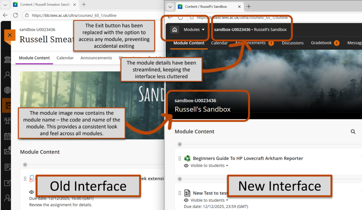
Before we explore the new module layout, it’s worth pointing out that the side menu now displays the users profile picture (if they have uploaded one). There’s also space between the standard menu items (such as Modules and Organisations) and the option to Sign Out of Blackboard, providing a clear distinction between these two areas.
One major change is that modules now open in full-screen mode to maximize horizontal space and reduce clutter. Previously, when you opened a module, you could still see the main interface “behind” the module (as demonstrated in the diagram below). Now, the full-screen view enhances the amount of screen space for users to engage with their course, free of distractions.
Lets explore some of the other new features.
Home button replaces Exit
The “X” to exit a course is replaced with a Home button that returns you to the main Institution page. Now, you will only see the “X” when you open content from within the module (for example, when you open a Blackboard Document or a Test).
Module Switcher
In the top left, you now have the option to click on Modules, showing you the last four modules you’ve been using, speeding up your navigation between modules. You also have the option to return to the Modules section, allowing you to access all of your modules.
Module ID and title in the header bar
The header now displays the module ID and title for better context.
Full-width banner
The course banner spans the full width of the screen with the course ID and title on a darker background for better clarity and accessibility. If your existing module images contained text, you might want to consider whether or not this is still needed, in order to aid consistency across modules.
If a course doesn’t have a selected banner, a placeholder image will appear at the top. When using brands, this image adopts Teesside University’s brand colour scheme, ensuring visual consistency across all courses.