
A stroll through social media will show you that there are many people sharing bite-sized information and visual content via infographics. This content is shared often because it is interesting and in a format that is easy to digest. When given the opportunity, people would often much rather look at an image or watch a video than read overwhelming quantities of text, and taking advantage of that for your course design can help improve learner engagement.
Why use infographics?
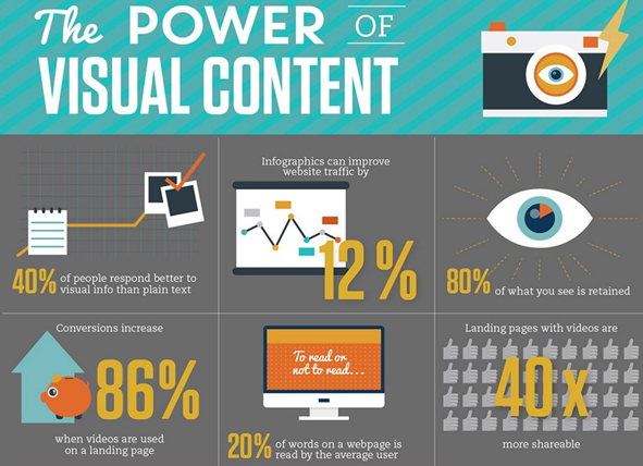
- Share research data or survey results or curate relevant statistics and data from multiple reliable sources and turn them into an infographic.
- Share relevant fun facts and put together some interesting facts relevant to a topic and turn them into an easily digestible infographic.
- Present information that’s easy to scan and process. If you have ‘how to’ content related to your learning and teaching resources, create a bite-sized guide to help your students learn how to do something. These also serve as downloadable assets that help students always keep a reference on hand.
- Infographics can make it easier to visualise comparisons. For example, health students could compare the effects of different medications or business students could compare the response rate to different marketing campaigns.
- Re-purpose existing content into something that has much more impact. You may have existing text-based content that is simply too long-winded to put a point across or highlight important information. All of this can be turned into an infographic and made more interesting and fun.

Click here to download the Using infographics in your course content help guide
If you need any further help, please contact eLearning@tees.ac.uk
Using infographics in your course content