One of the things that I’ve been trying to do since taking on this AD role is improve the learning spaces in our School. We’ve got great labs, but our more flexible spaces are poor by comparison. To be honest, it’s been a key aim of my annual L&T plan for two years and strongly supports our TU Future Facing Learning framework, but this year I’ve been able to extract some funds from the School to address this issue. Where to start though? The relatively recent extension to our Orion Building created some new space there, but the Stephenson Building has been severely lacking. You know what I’m about to say… Until NOW!
The Stephenson Building has superb facilities for engineering practical sessions, but it’s hard to find welcoming space for any other style of learning. Anyone who has taught in Higher Education will tell you that students learn in different ways and styles – this is nothing new. But what is more recent is an investment across the sector in a greater variety of spaces to support these different learning styles. Advance HE, for example, have published a handy review to support the design of learning spaces in this context of increasing student diversity while Jisc have recently released something similar but through a lens of digital developments. Saying this, there’s not actually a huge amount in the published literature, but Andrew Middleton’s Reimagining Spaces for Learning in Higher Education is worth a read.
The Stephenson is a tricky building to create new spaces in though, as it’s basically a long cavernous corridor with labs and offices pinging off the sides. Last year we were able to get some informal chairs laid out, and I managed to get the long wall repainted from a dark aubergine to a teal which lightened up the whole space. I stand by that decision despite the faces that some of our Design staff pulled. I went for corporate colours, alright, jeez… Anyhow, in between some of our labs are some dead spaces – areas which are little more than weird dark, grotty little corridors. Perceived wisdom said that these were fire escapes, but this wasn’t true. Looking into these areas a little more has made me realise that the Health & Safety staff are actually lovely people, and that you can never trust anything anyone says to you!
So, as hard as it is for me to admit, I don’t actually know everything. Rest assured I’ll never say that again… In terms of these spaces, I knew that I wanted to create bold, exciting and appealing areas for formal and informal work, and although resources like FLEXspace (an open resource that brings together practitioners, experts and decision makers in higher education, libraries, and museums who are focused on campus planning and facilities, learning technology, etc) are useful, I didn’t really know how to do it. Thankfully we have a super-talented cohort of interior design and architecture students led by brilliant staff (Richard, a University Teaching Fellow, and Leanda). Acting as the client (actually I wasn’t acting, I was the client…) I asked our students to get to work.
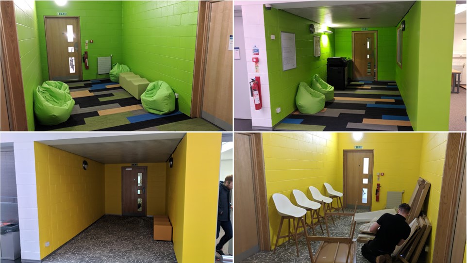
As you can see, these areas have been utterly transformed. They’re not quite finished yet, and there is a hot pink area which isn’t shown here, but I was so excited I needed to show off now. And it’s already working! To my absolutely delight, as I was showing these spaces to my Dean, there were actual students sitting around using this newly created usable space.
One of the real pleasures of my role, as I’ve said and implied before, is being able to support our students. Sometimes it’s nice to be able to do this in a very real way. And by very real, I mean very very brightly coloured…

